TRI Fold Brochure
This project helped me with learning how to create a simple TRI Fold brochure from the Design Events course. The goal was to create a brochure to promote the services of an existing or a fictitious company. The TRI Fold brochure below was an upgrade and not the original that was submitted for the assignment. I added nail colours, coded with pinks and greens, the nail images were drawn in Adobe Illustrator, and the typography was changed for legibility. I also added customer reviews to promote the salon.

—————————————————————————————————————————————————–
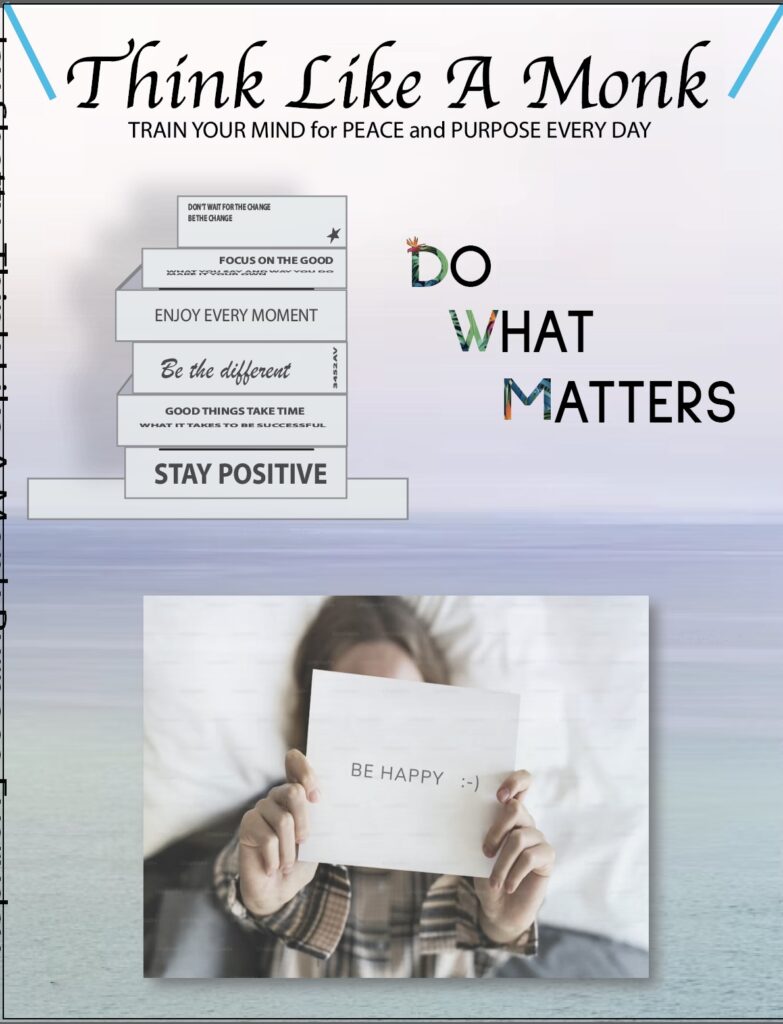
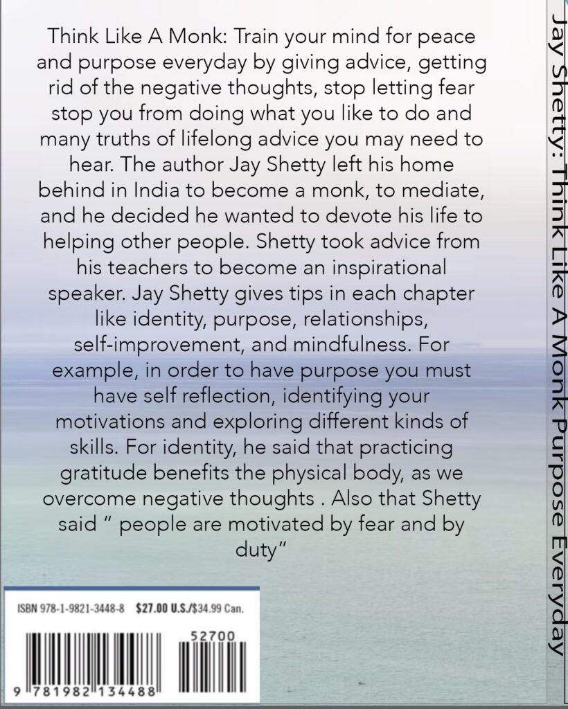
Think Like A Monk Book Cover
The project requirements were to create a simple Book Cover from my Media Communications course. The goal was to take an original book cover that already exists, and alter it to have a brand new book cover. I enjoyed challenging myself to bring the best of my skills, as a graphic designer. The software I used for this book cover for “Think Like a Monk: Peace and Purpose Every Day” was InDesign, and I edited it with Adobe Illustrator. The purpose of creating this book cover was to capture the reader’s attention and sell the book.
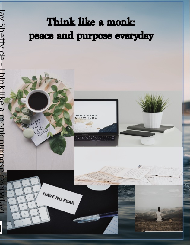
Rework for book cover for Think Like A Monk: Train Your Mind for Peace and Purpose Every Day
I wanted to rework my book cover because it needed to be cleaner. I felt like everything was just not matching the way I thought it would look. The images were not conveying to the reader that this is a positive book. I personally think adding cohesive images, redoing the title, adjusting paragraph styles, and organizing everything correctly would help.
Brand New Book Cover
—————————————————————–
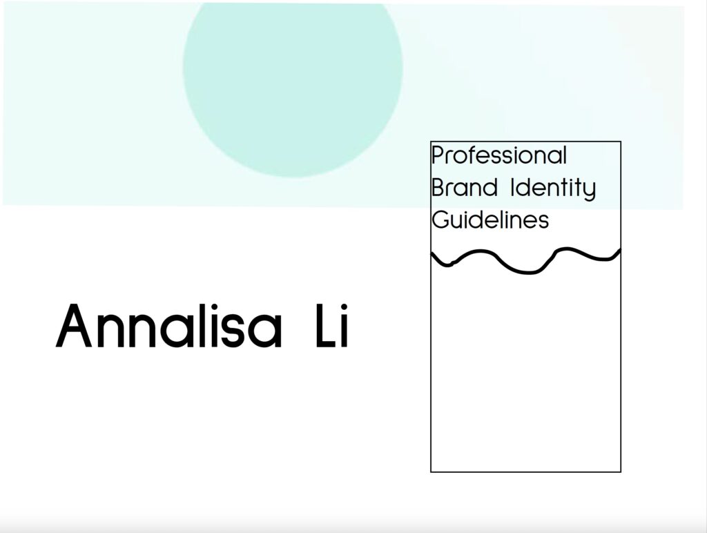
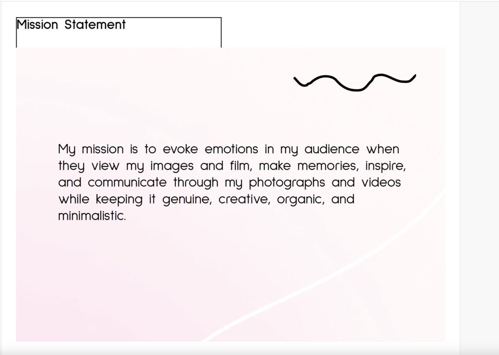
Brand Identity
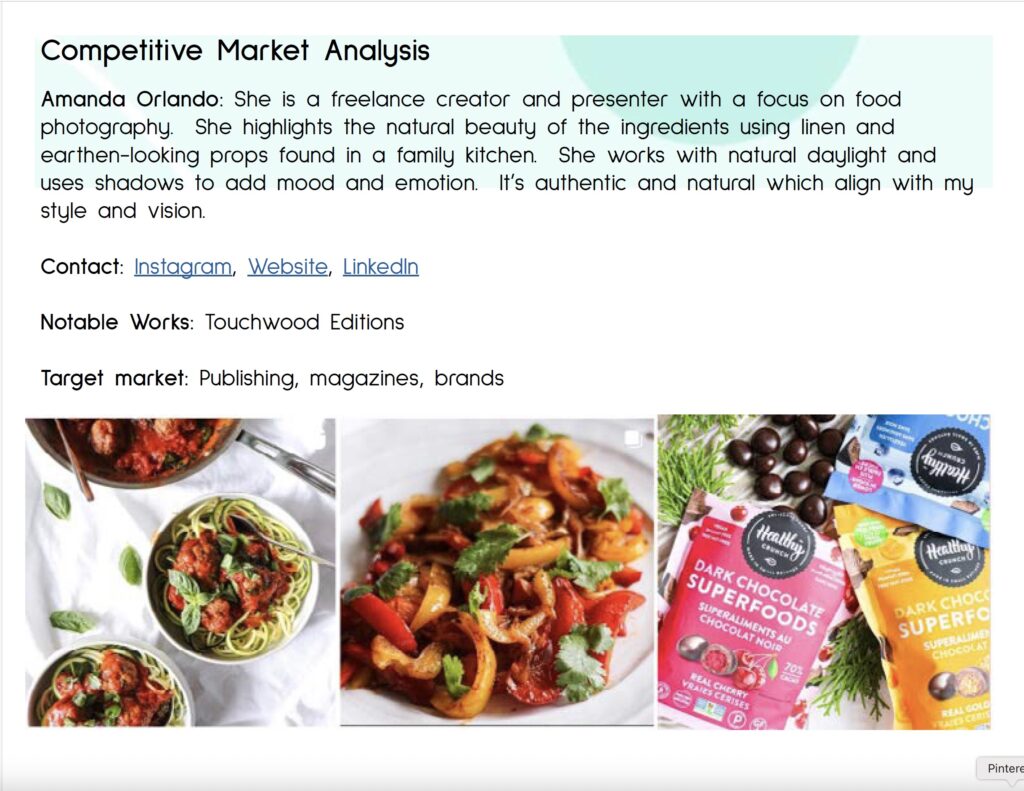
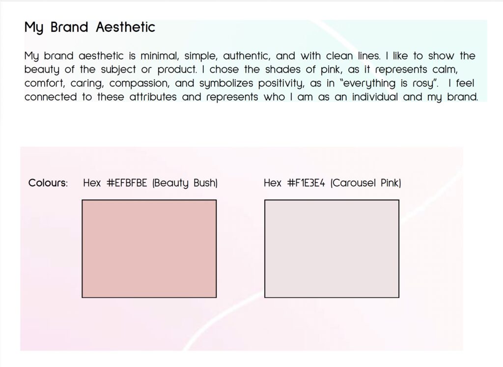
This project has helped me with learning how to create a brand identity guide to represent yourself or having a degree. All of this is by using all the skills learned in the Media Communications program. The goal of this project was to brand yourself as a photographer, videographer, social media manager, UX/UI designer and many more. This is my brand identify, a photographer who does travel, food and architecture with showing off my personal logo. I picked the colour pinks in this as my brand aesthetic because it represents who I am as a photographer and videographer.
—————————————————————————————————————————————————–
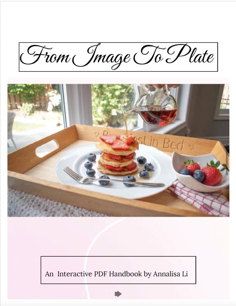
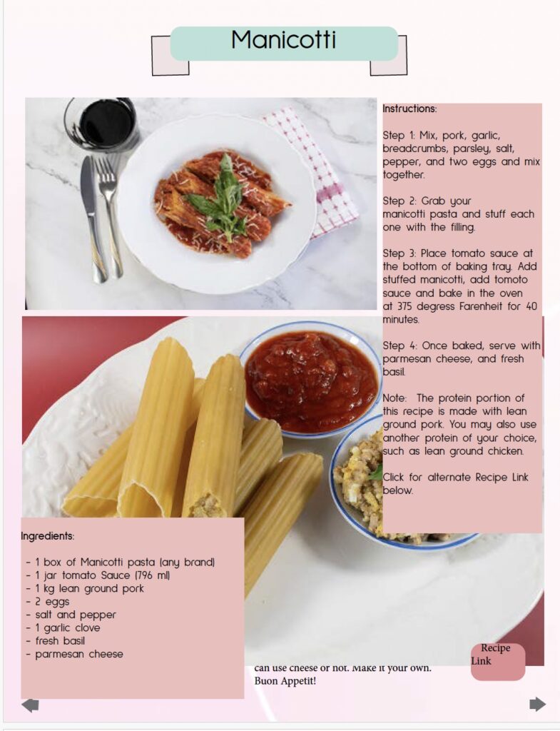
Capstone Project Sneak Peck